The Kaspa HODL Wave Chart
Learn how to read the Kaspa HODL Waves chart. This chart visualizes the aging of Kaspa's circulating supply, offering insights into network activity.
Posted: Jan 26, 2024
By: Kaspalytics
What is a HODL Waves Chart?
The Kaspa HODL Waves chart can look a little intimidating at first, but it’s actually quite straightforward.
Put simply - the Kaspa HODL Waves chart shows the percent of Circulating Supply (CS) last moved by age bucket. This data is calculated once daily using on-DAG (on-chain) data. You can read more on the calculation method below. The daily data is then plotted on a chart, so we can look for trends over time.
Starting With: Raw data
Let’s get a little more specific. The raw data for a single date can be helpful in understanding. We’ll take a look at December 31 2023:
| Last Moved Age Bucket | Percent of CS |
|---|---|
| Within the Last 1 Day | 5.47% |
| 1 Day to 1 Week Ago | 6.24% |
| 1 Week to 1 Month Ago | 14.76% |
| 1 Month to 3 Months Ago | 24.19% |
| 3 Months to 6 Months Ago | 15.08% |
| 6 Months to 1 Year Ago | 18.60% |
| 1 Year to 2 Years Ago | 13.59% |
| 2 Years to 3 Years Ago | 2.07% |
| 100% |
Essentially, what this data says is “in the last 24 hours, we saw 5.47% of the CS moved”. Now, “moved” doesn’t mean it was necessarily sent to another person. This includes all transaction data. Which means transaction change, transactions to self, transactions to other people, to and from exchange, and so on.
Which Brings Us To… The Kaspa HODL Waves Chart
As mentioned, this daily data is then plotted on a special chart. Creating the colorful, wavy Kaspa HODL Waves chart.
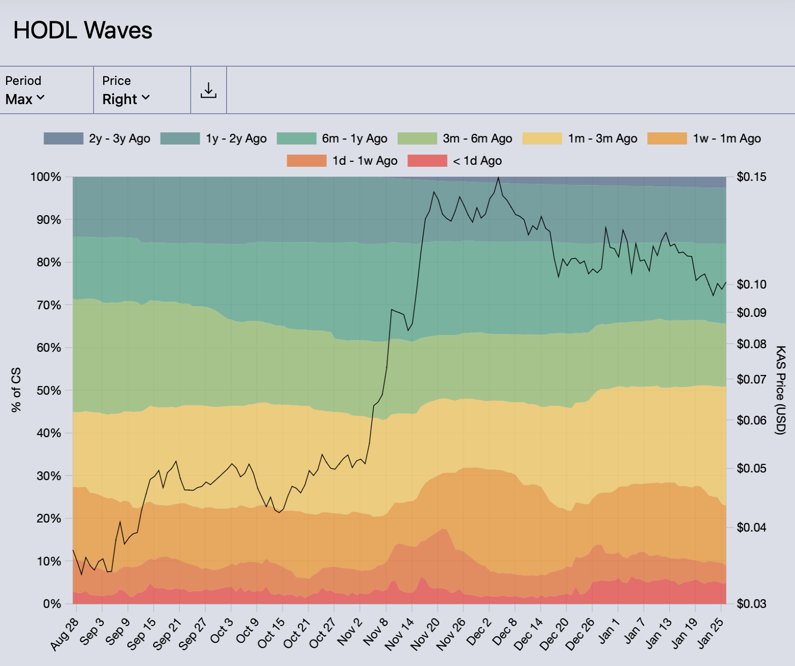 The Kaspa HODL Waves Chart.
Shorter-Term Age Bands
The warmer colors along the bottom of the chart represent the short-term age bands. The red band along the bottom is the shortest term. Let’s remove the medium and long-term age bands, to focus exclusively on the short-term age bands:
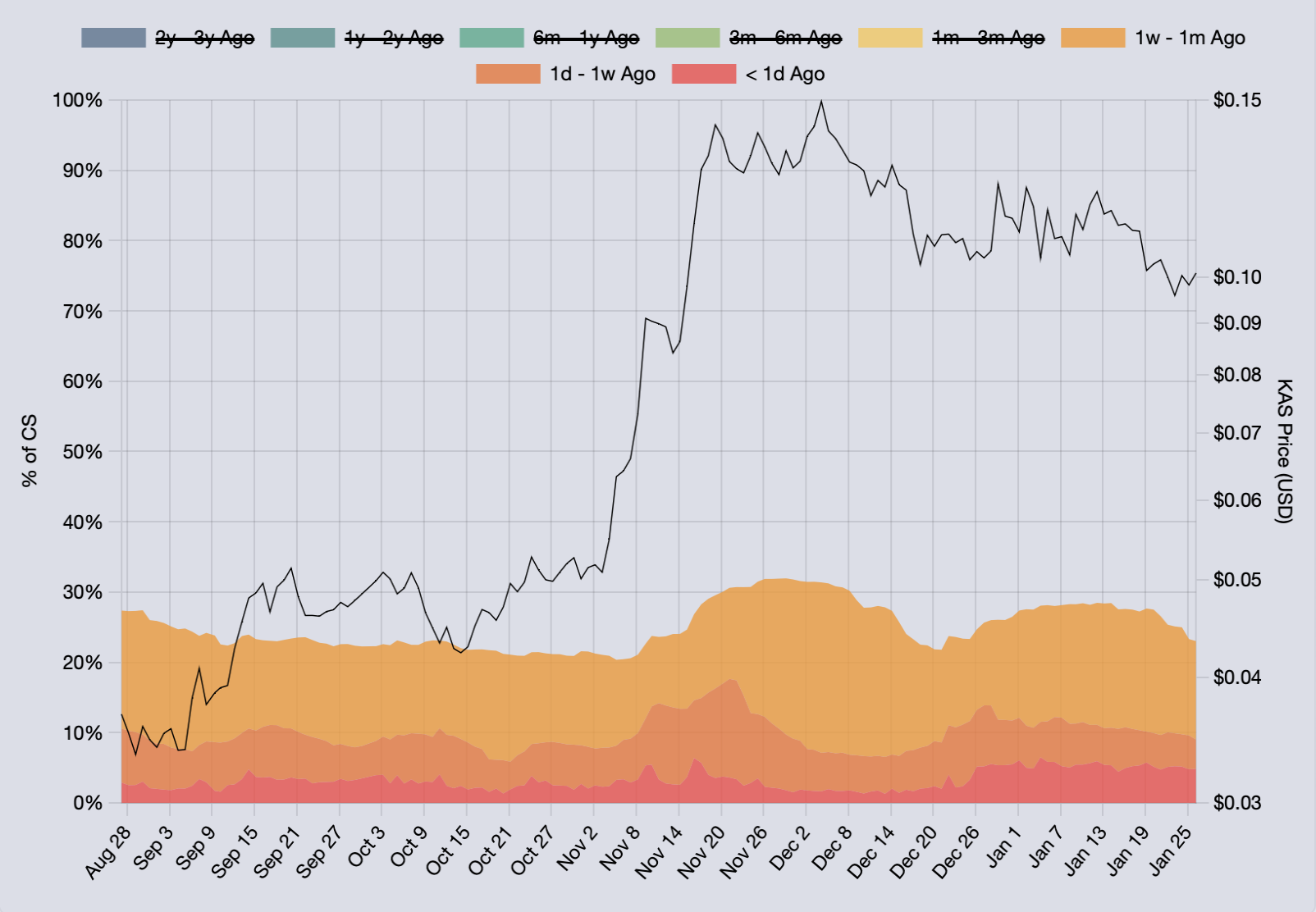 Short-term HODL Wave age bands.
One interesting observation here is that roughly 25% of CS has moved in the last month!
Longer-Term Age Bands
The cooler colors (greens, blues) at the top show the longer-term age buckets. When the short-term age bands are removed, the long-term age bands display at the bottom of the chart. This can be useful when analyzing this data.
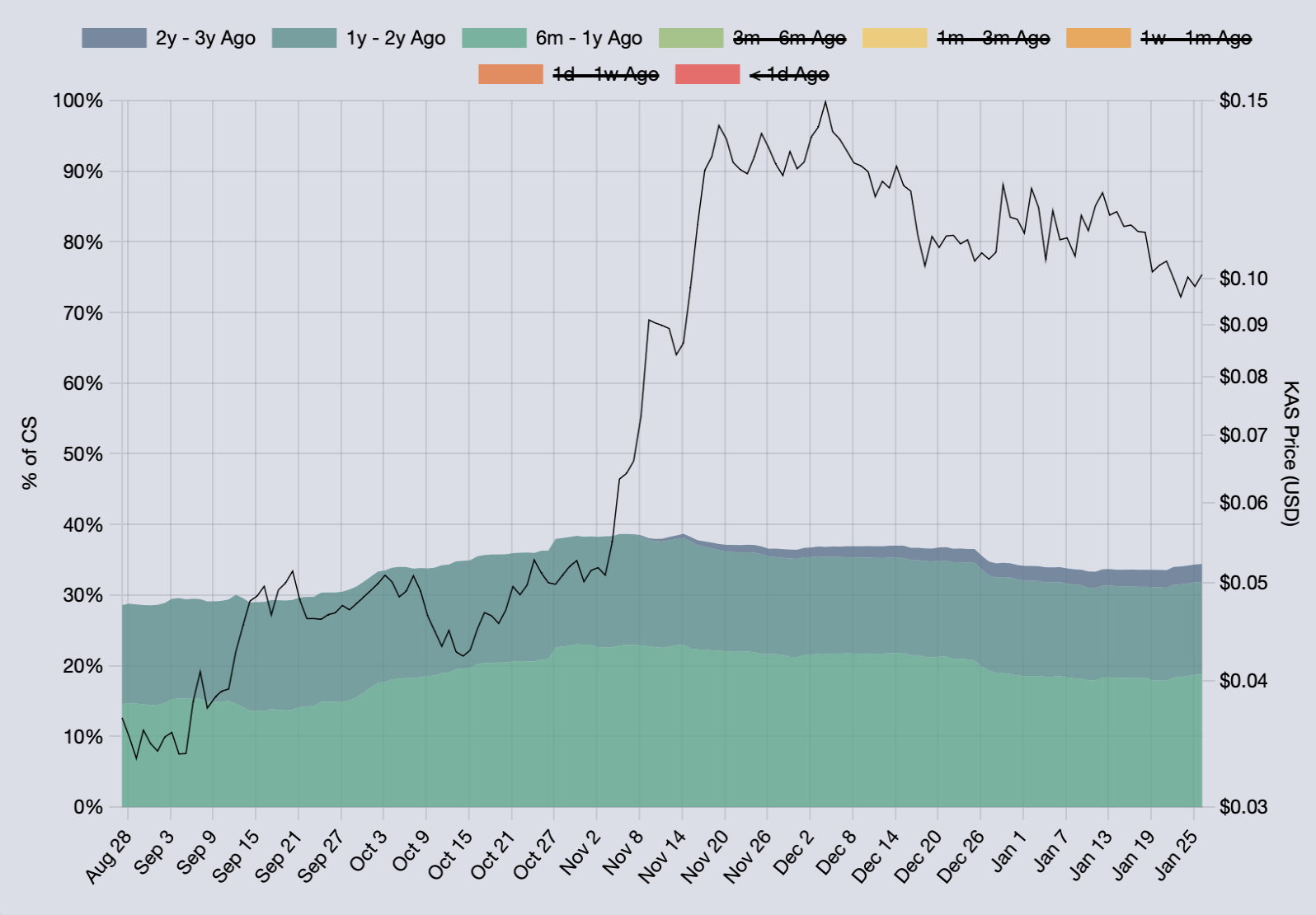 Long-term HODL Wave age bands.
An inverse observation can be made here - roughly 35% of CS has not moved in more than 6 months! That’s indicative of people HODL’ing.
Insights from the Kaspa HODL Waves Chart
When we see an increase in the red age band, it means older KAS is on the move. This could mean the owner of the formerly-old KAS is moving their KAS to a new address, or compounding UTXOs, or moving to/from and exchange, etc.
KAS then ages up from the lower age bands if it remains unmoved. This is most noticeable when looking at spikes in the red (Less Than 1 Day Ago) age band. If you trace up and to the right from a red band spike, you’ll typically see the other bands increase accordingly as time goes on.
As time goes on, new age bands are introduced. These start in the upper right corner and show KAS that has not moved in the longest time period available.
As you’ve probably guessed, this data alone in isolation is interesting. Where it really shines is when additional context is added.
Price is one of the current driving factors behind network activity. As a result, you’ll see the most age band movement around large price increases/decreases. Hence why we like to include price in this chart.
Since late December, the percent of CS in the red (Less than 1 Day Ago) age band has been consistently ~5%. Prior to late December this age band has been in the 2% - 3% range, with spikes up to 5%. Consistently hovering ~5% for the last month is indicative of some sort of unusual network activity. By looking elsewhere, we noticed that the total number of UTXOs has been steadily decreasing since late December. Coincidence? Most likely not, these two separate data points are probably the result of the same network activity.
Any fluctuations or deviations in the age bands will most likely be driven by out of the norm network activity. As a result, this chart is a good indicator of something happening on-DAG.
Comparing to Bitcoin
With Bitcoin fulfilling the digital gold role, one could argue that Kaspa HODL Waves chart should look different than Bitcoin’s.
If Kaspa adoption results in heavy transactional use, the short-term age bands should consistently contain a larger share of CS. Relative to Bitcoin, my belief is that over time the Kaspa HODL Waves Chart will: 1.) consistently show a larger share in the short-term age bands; 2.) have narrower middle-term age bands; and 3.) have similar long-term age bands.
Data Calculation Process
This data is calculated by first estimating the timestamp of each UTXO in Kaspa’s UTXO set. Since Kaspa doesn’t store timestamp with each UTXO, the DAA score of the UTXO is used to estimate the timestamp.
Then, the age is calculated off of the estimated timestamp. Then, each UTXO is aggregated into buckets by age. Then, a precent of the overall CS is determined for the given bucket